ASM Logo GIF
trending_flat
CASE STUDIES
Elderfarms
About
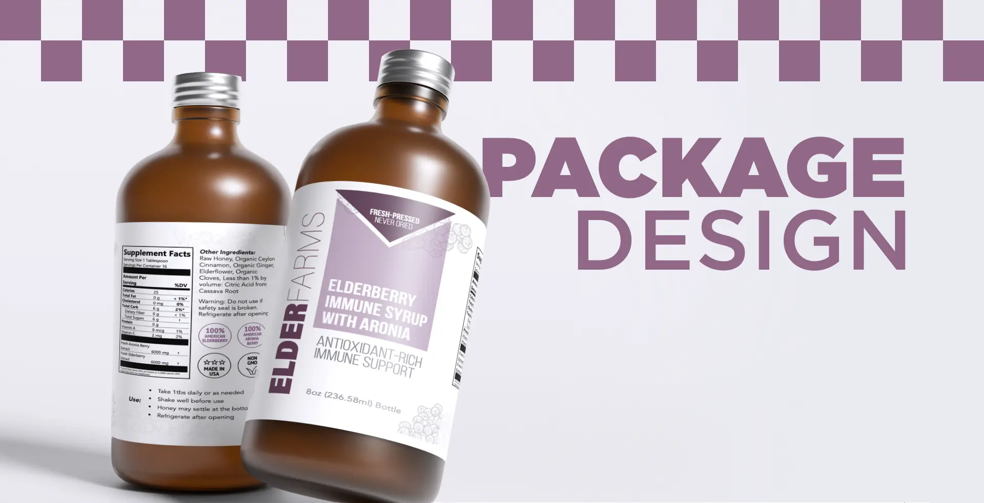
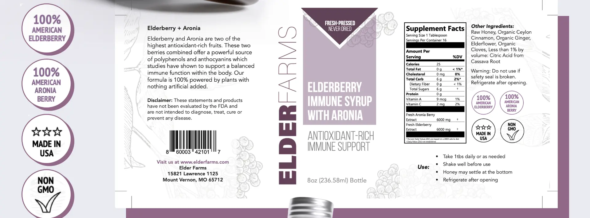
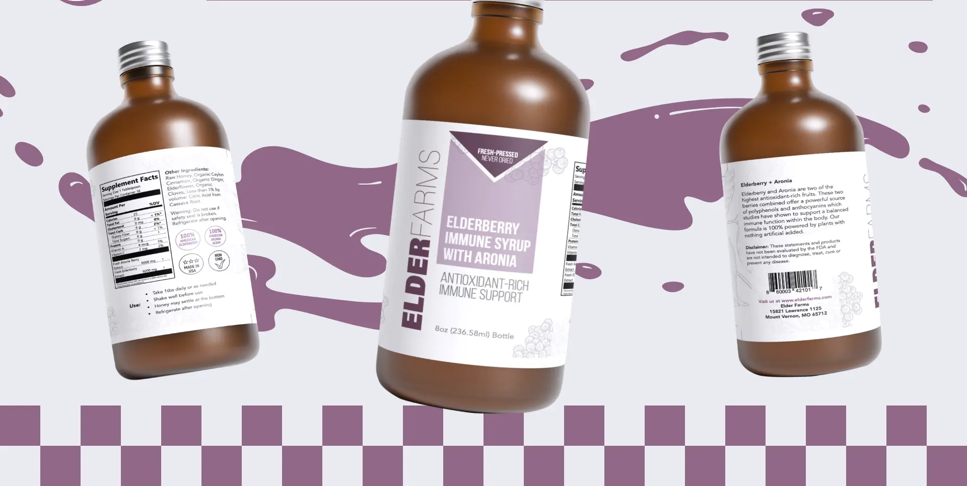
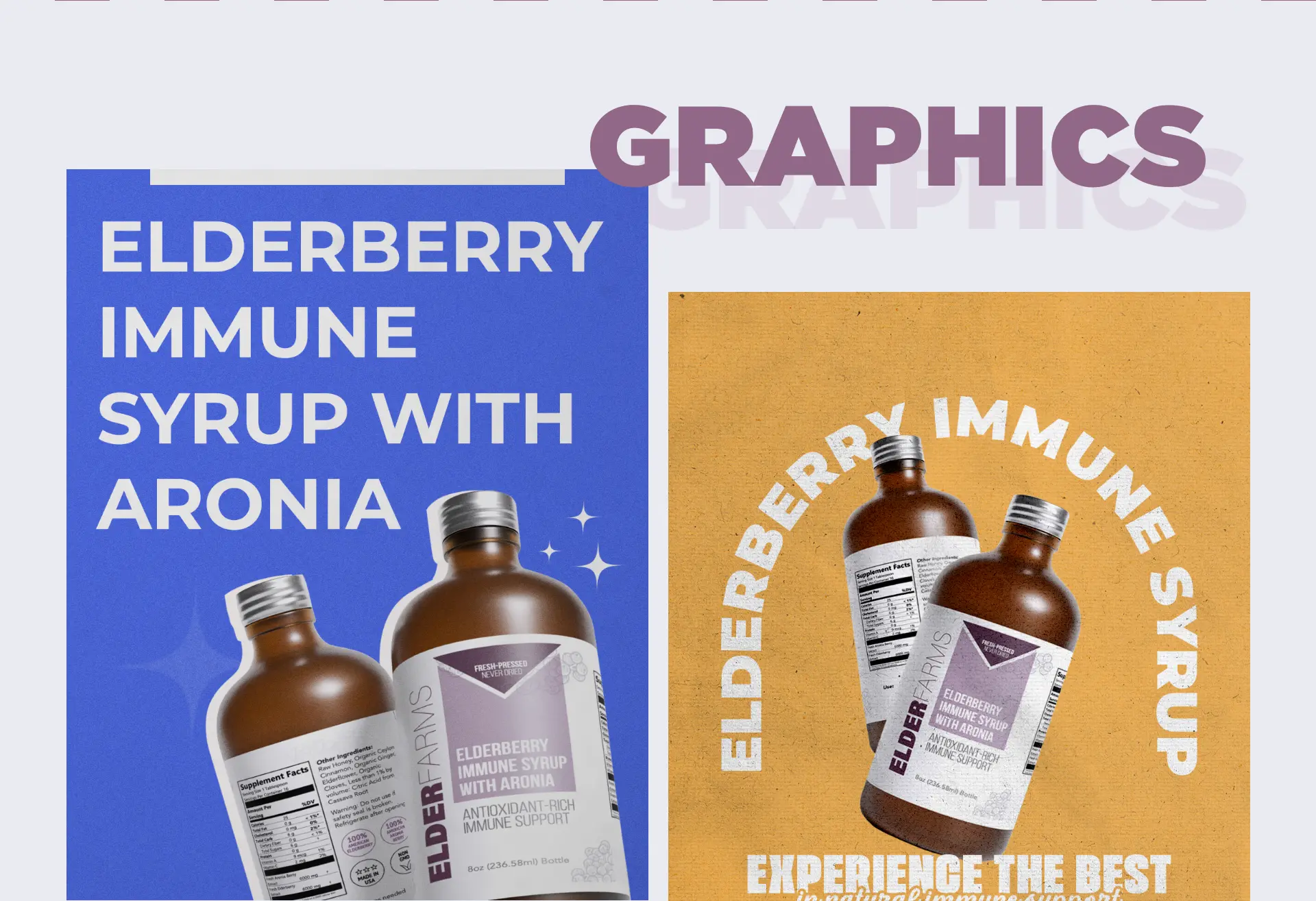
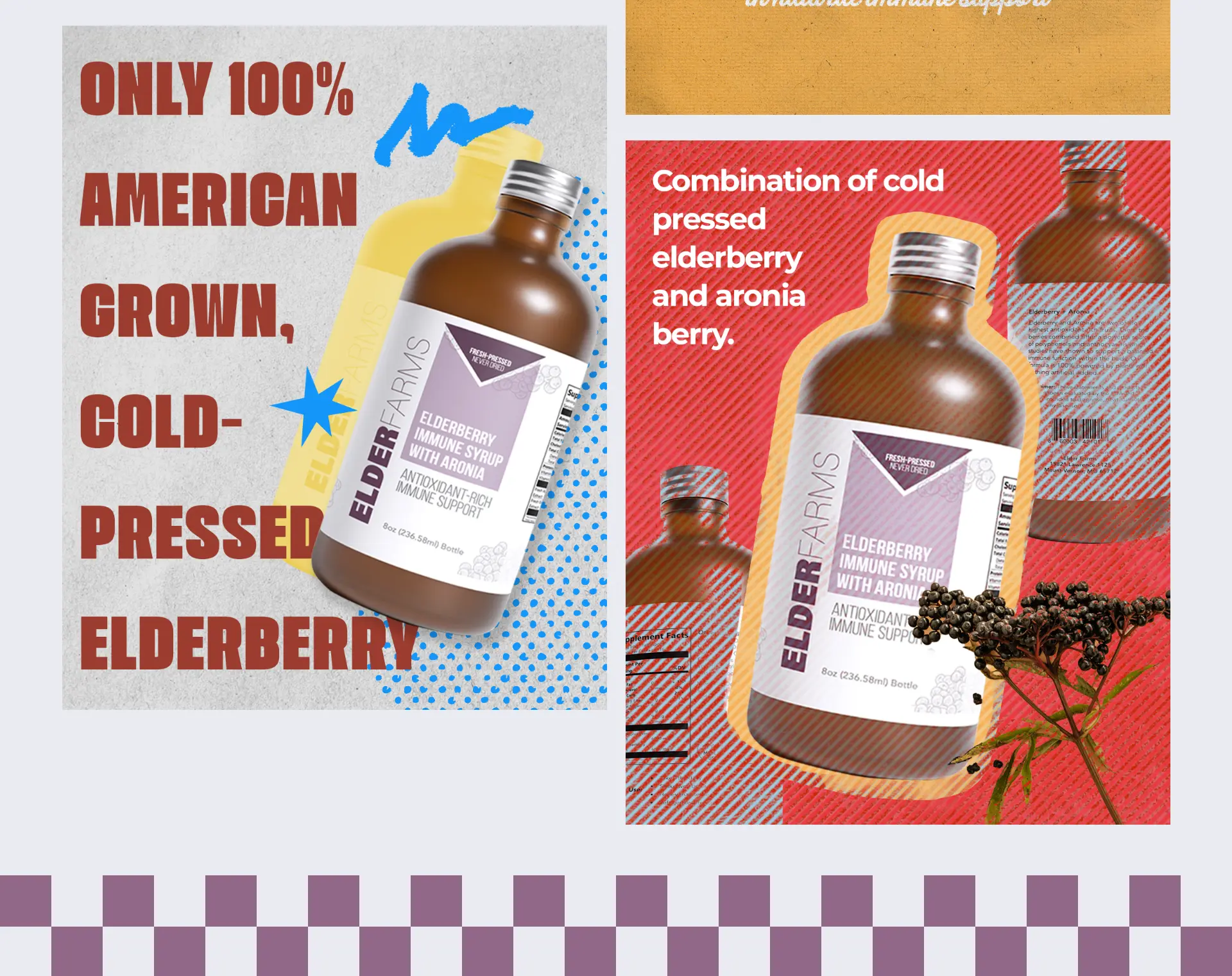
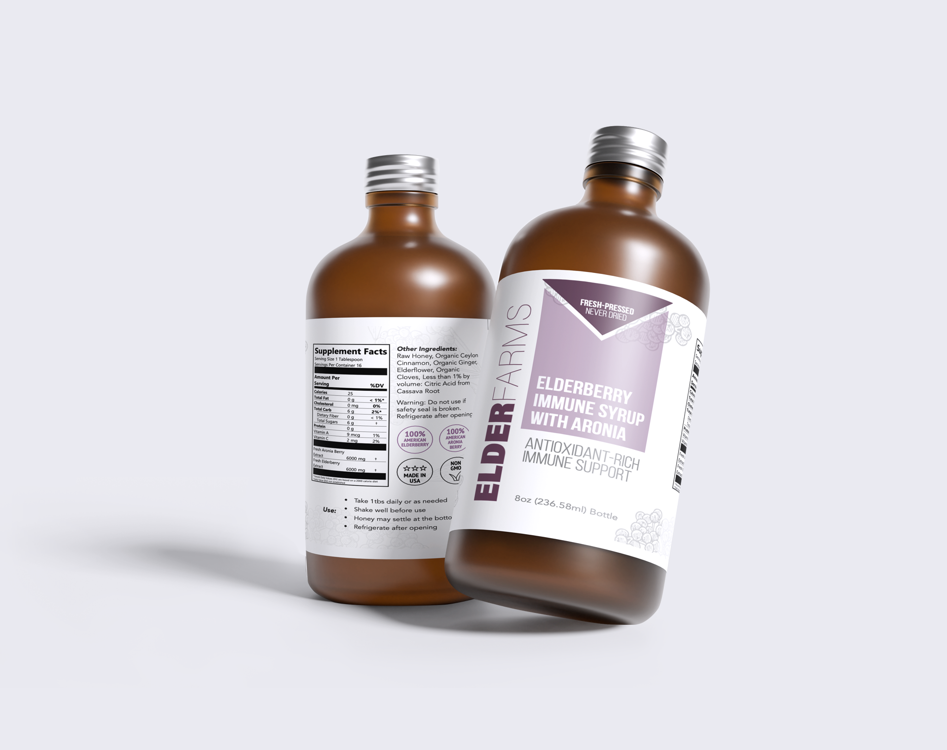
Elderfarms is a wellness brand rooted in the power of elderberries and natural ingredients. Their mission is to create high-quality, immune-supporting products that are as good for the planet as they are for their customers. With a growing retail presence and loyal following, Elderfarms wanted their visual identity and packaging to better reflect their values of purity, craftsmanship, and trust.
Problems identified
Despite a strong product lineup, Elderfarms’ previous packaging lacked consistency across SKUs and didn’t clearly communicate the brand’s natural, premium positioning. The visual design felt dated and didn’t stand out on shelves or online. In addition, supporting brand graphics across social and marketing materials weren’t unified — making it difficult for Elderfarms to maintain a cohesive identity across platforms.
Our plan
Our team set out to refresh Elderfarms’ look with a packaging redesign that balanced clean modernity with the brand’s natural roots. We focused on refining color palettes, typography, and hierarchy to improve shelf impact and readability. Alongside the packaging, we developed a suite of supporting graphics and design elements that extended the new look into digital and social channels, ensuring a seamless brand experience from product to platform. The result was a refreshed identity that strengthened brand recognition and elevated Elderfarms’ presence in the competitive wellness space.
No items found.
How we
make brands win